Capo Tool and Engineering Logo & Brand Design
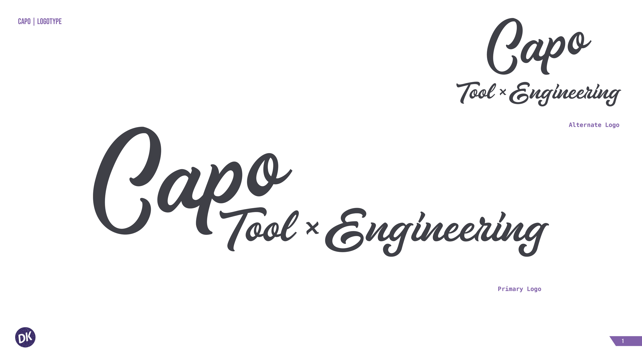
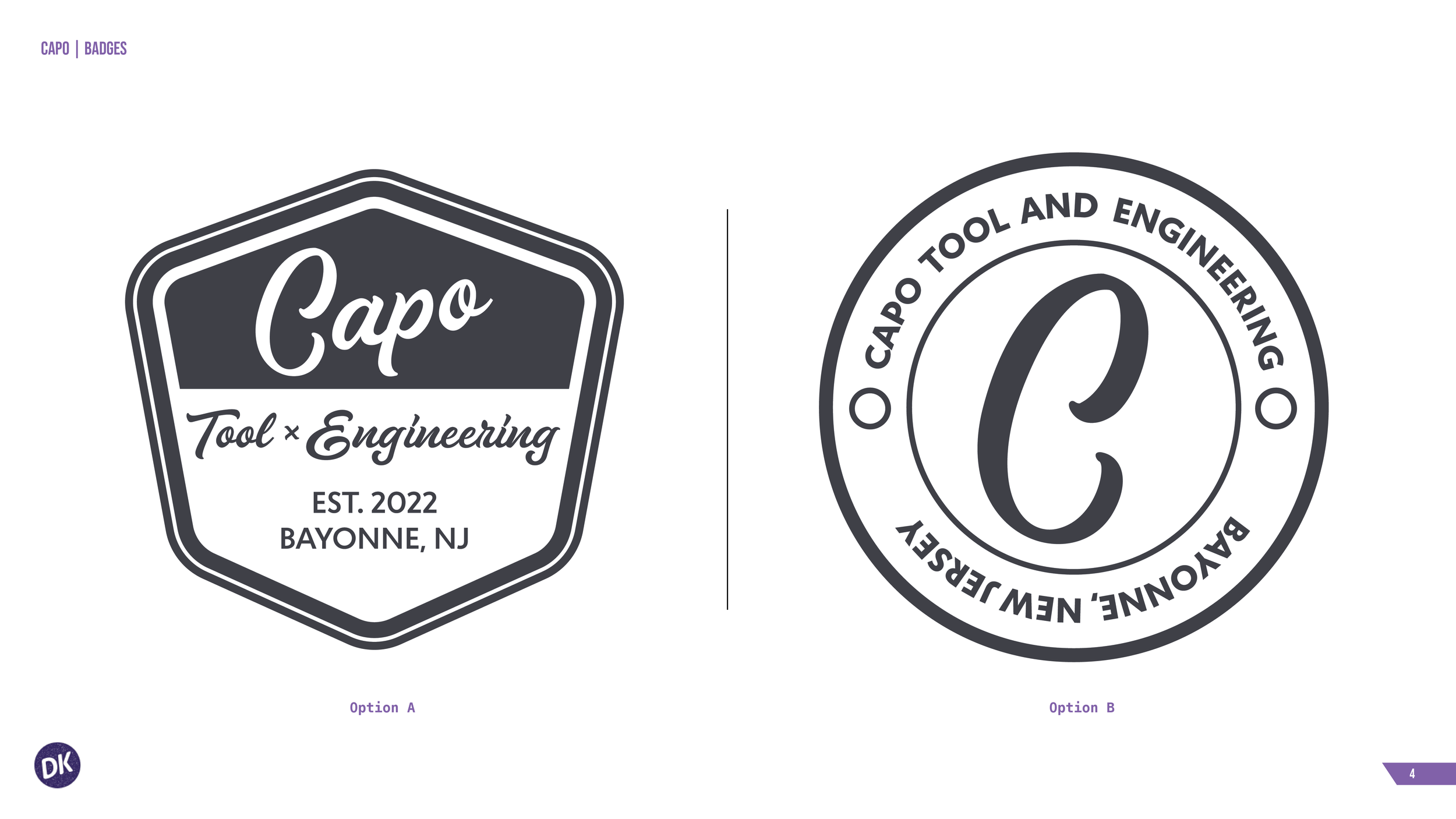
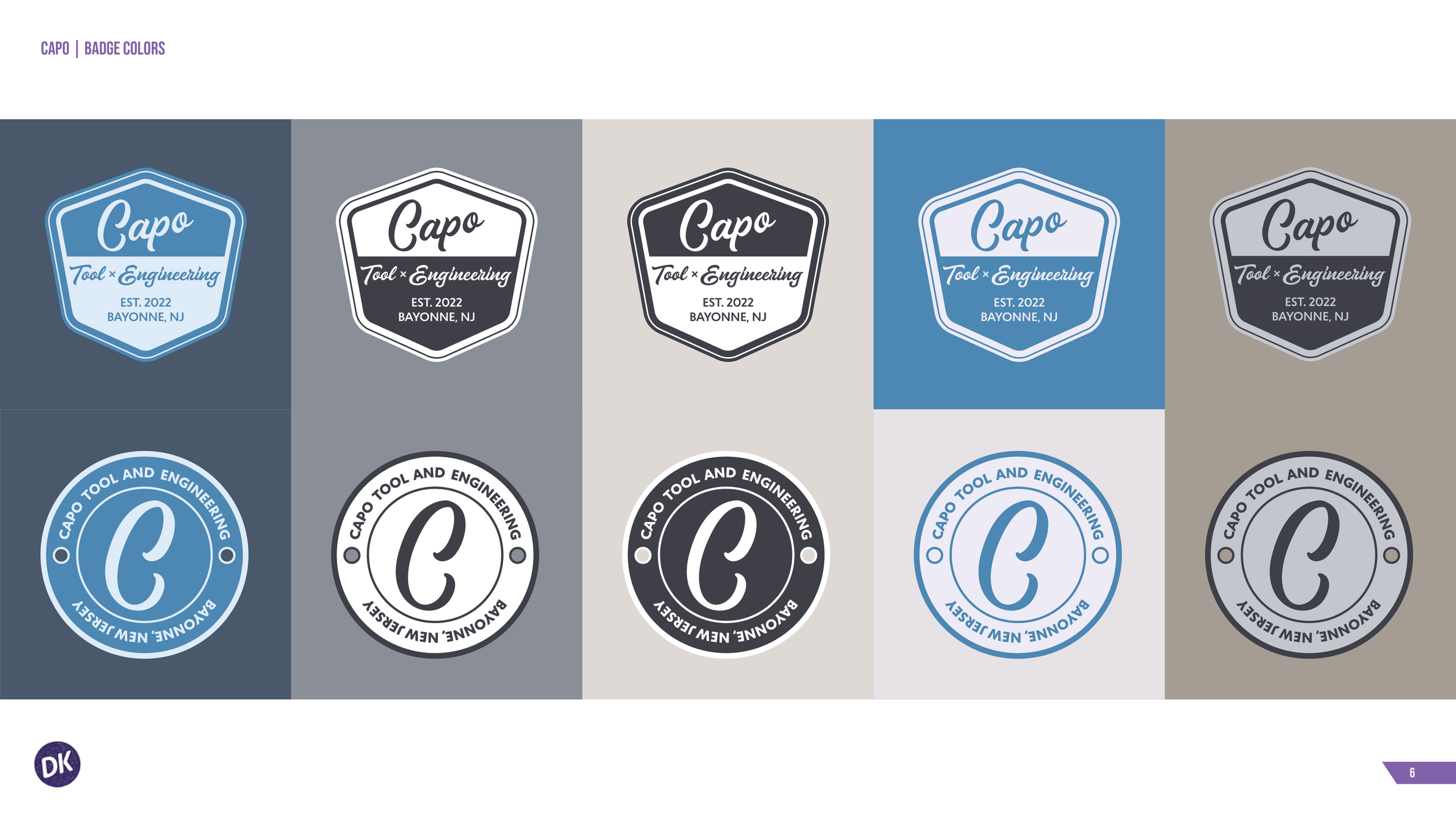
Capo Tool and Engineering came to me for a fresh take on an up-and-coming tooling and engineering shop based in northern New Jersey. I developed a brand that was both youthful and bold to differentiate Capo in a market that is retro and often dated. I focused on a very clean design, to speak to the engineering precision involved in the business, as well as incorporated hexagon shapes paying homage to nuts and bolts of their tooling. I created a variation of logotypes, a logomark for tooling purposes, a color palette centered around the Capo Blue color and various badge designs to be used on machinery. This project involved strategic thinking and risk taking to push new bounds in a very stiff market, but the owner loved the direction and continues to be a client.